Even if YouTube hasn’t announced officially via Facebook or Twitter, they are trying new interface to provide better user experience on YouTube. This new look is much more easy to use than the old one and they should have done it long time ago. Even if they haven’t stated any change, they apply these changes right after trying them couple of times so far.
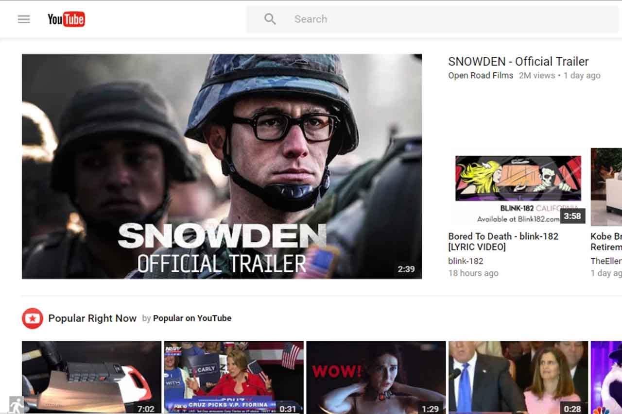
This Was Old YouTube:

This Is New YouTube:
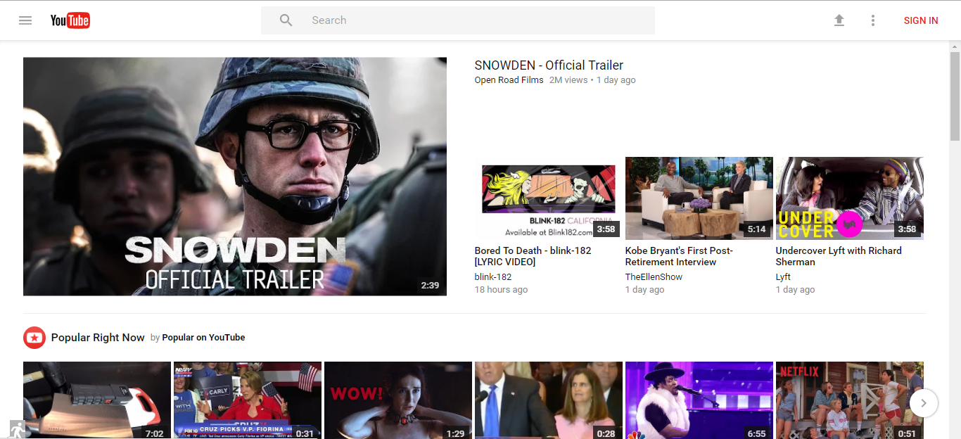
First thing you notice is the new search bar which looks exactly like new Google Plus interface. I am glad they finally stopped using that search bar because it looked very old-school.
They also stopped using blue color which is I think a very good choice. Using more than three color confuses most user and this time they did it right. They use only three color other than white background; black, red and grey. They also canceled boxed design and use wider design.
However, most important development they’ve done, in my opinion, is putting settings on top of the page. Because every single time those settings find a way to change themselves and people have to scroll all the way down to the bottom the change the language settings. When you change language settings, page refreshes itself and once again, you have to scroll all the way down again to change country settings.
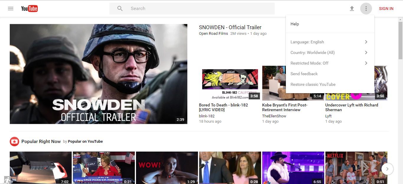
As you can see they put those settings on the top and you don’t have to scroll anywhere to change them. You can also send feedback at top which, in my opinion, will increase the feedbacks and help YouTube improve.
New YouTube Channel Screen
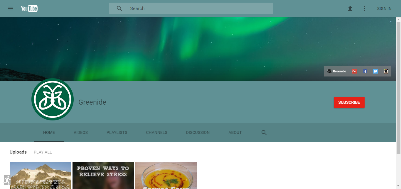
Channels also have a new look but I guess they haven’t fully change it yet. Because new YouTube definitely looks more professional than the older one and channel pages doesn’t have that professional look yet. Blue part is originally blue by the way; I didn’t select or highlight that part intentionally.
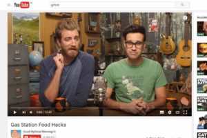
New Search Screen
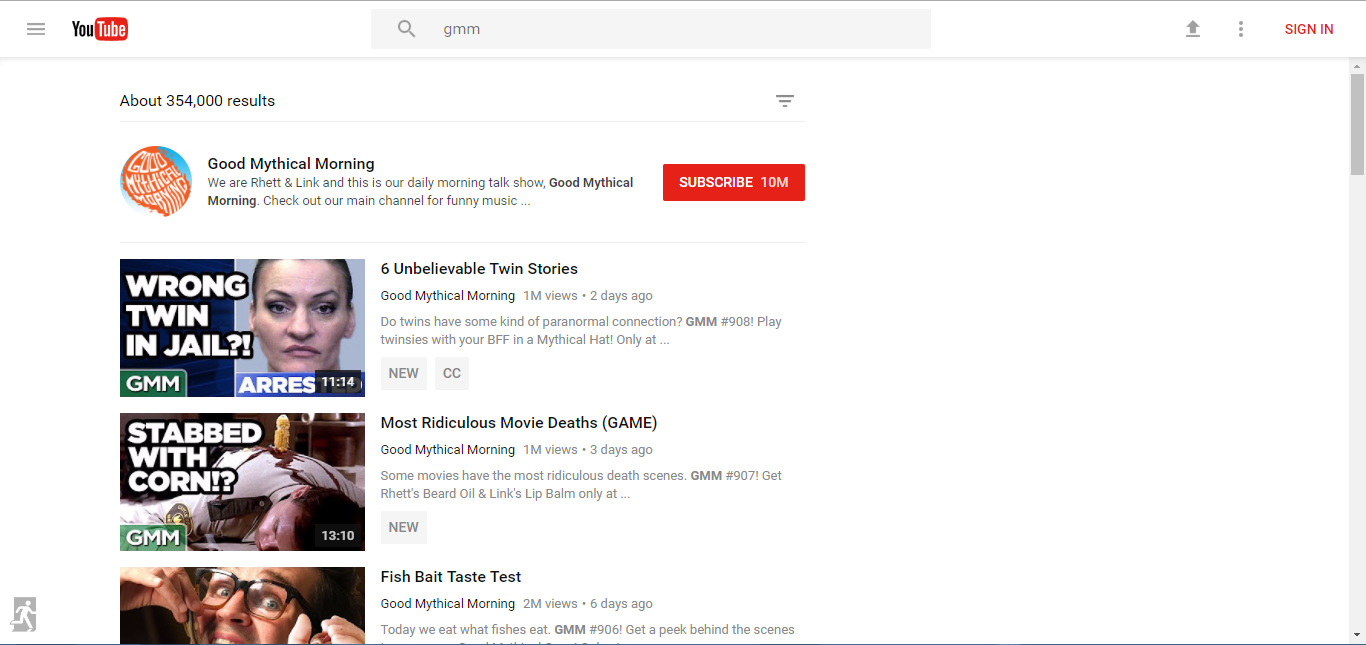
When you search something in new YouTube (I searched my favorite channel), this is the result screen you will see. Once again more simple and plain design but looks more professional and better. They also use bigger and more eye-catching “Subscribe” button for this new look, which will probably increase number of subscribers.
New Filter Screen
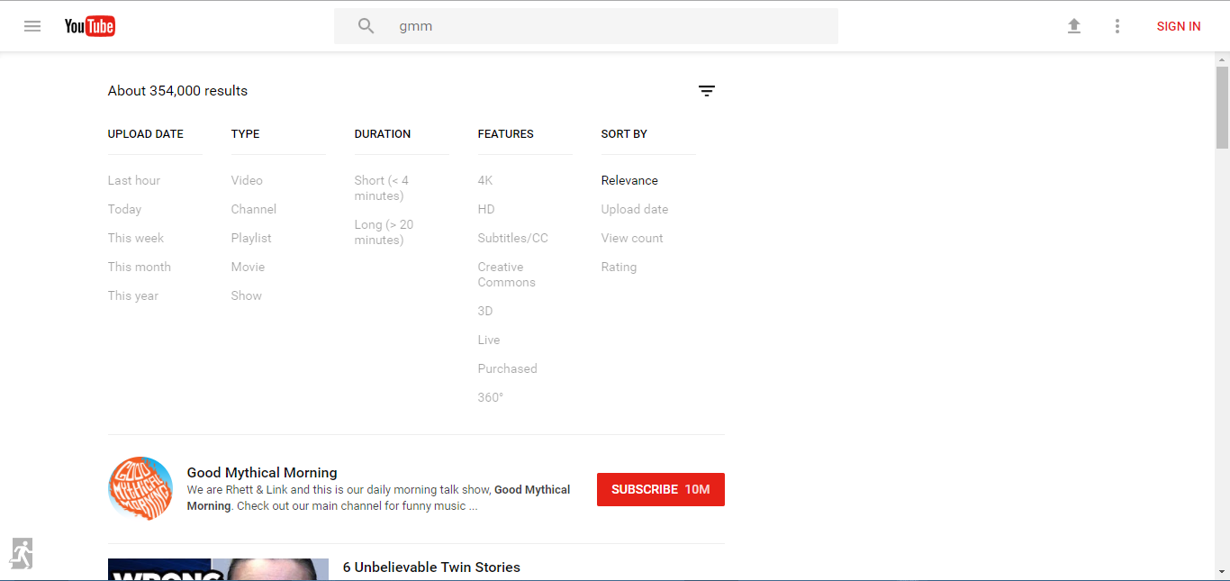
This is the new filter screen; instead of clicking “Filter” box, they use three horizontal line.
Watching Videos
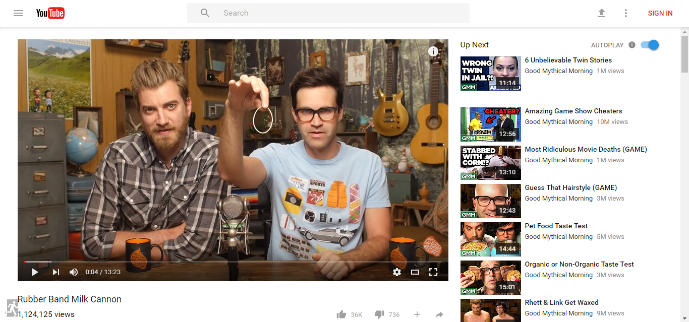
This is the video screen and for the first time, we see a color other than red, black or grey. I think they could use red instead of blue “autoplay” switch but apparently they decided otherwise.
Restoring Classic YouTube
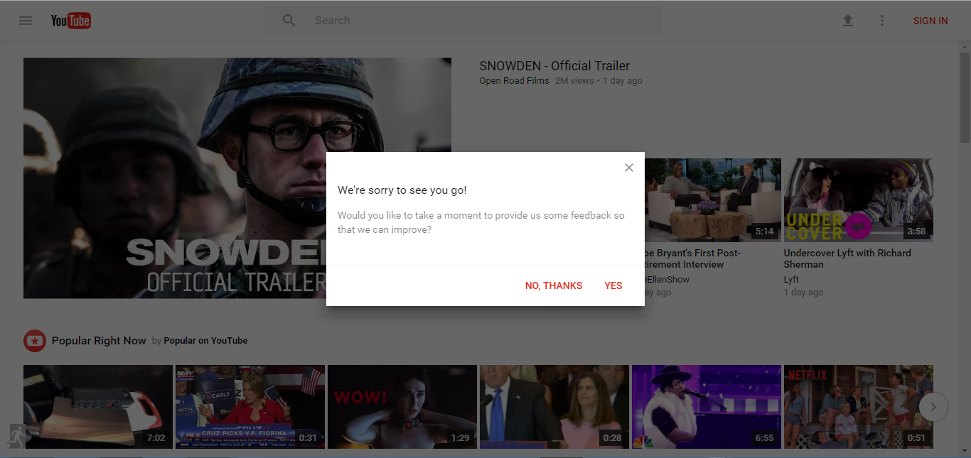
You can always head back to classic YouTube by clicking “Escape” sign where you can see left bottom of the screen. However, when you do that, YouTube apologizes and asks feedback.